Proxima
Proxima
Proxima
Reverse-engineering Praktio's existing component library into a full-fledged design system.
Reverse-engineering Praktio's existing component library into a full-fledged design system.
Reverse-engineering Praktio's existing component library into a full-fledged design system.
Design Systems
Figma Prototyping
Design Systems
Figma Prototyping
Design Systems
Figma Prototyping
summary
A great design system has all of the markings of a great product: it solves for user needs (both devs and designers), anticipates and attempts to mitigate human error, and should not require an instruction manual to use. After auditing Praktio's existing Storybook, website, and products to identify common components, I started to recreate and expand upon them. I set up Proxima in Figma to enable our devs to interact with familiar components in a familiar way while giving them access to the power of the prototype and dev mode.
summary
A great design system has all of the markings of a great product: it solves for user needs, anticipates and attempts to mitigate human error, and should not require an instruction manual to use. After auditing Praktio's existing Storybook, website and products to identify common components, recreating and expanding upon them was no small task. By setting up Proxima like a standard website in Figma, we allowed our devs to interact with familiar components in a familiar way while enabling them to leverage the power of the prototype and dev mode.
To best experience the media in this case study, switch to tablet or desktop.
The design system was the first project I tackled when I came to Praktio because I knew it would make everything that followed much easier. The design system audit also helped me to get my bearings in a new system and learn the products I'd be working on.
After working through an audit of the existing component library and breaking out some other reused elements I thought belonged in the design system, I got to work rebuilding from the ground up in Figma.
Why build custom instead of using an existing library?
When I joined Praktio, the team had just launched a new version of the learning management system and were in no rush to tear it down. While it would have been a lot easier on me to start with an existing library, it saved the devs from having to rebuild big parts of what they'd just launched, and enabled me to set up my components in a common language that was already a known quantity.
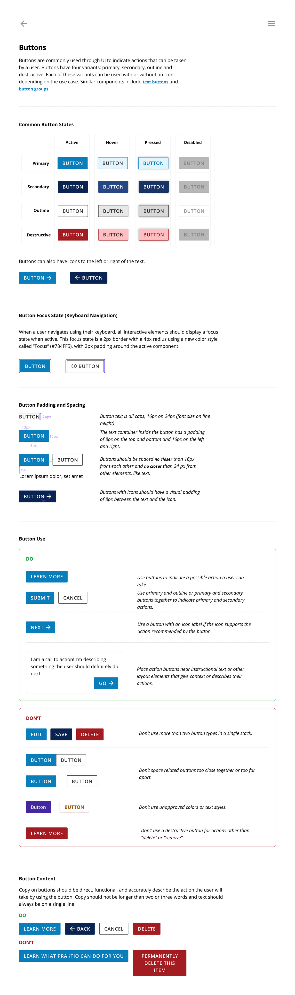
After I had the basic component states built out in Figma, I had a psuedo-interview with our lead dev to talk about the design system as a product and how he saw himself using it. We ended up deciding to include four primary sections for documentation: states, padding and spacing, do's and don'ts, and content (sections for related components and patterns as well as focus states were added in subsequent versions). Including documentation at the component level enabled a few things: I could be more hands-off with the devs implementing design changes since some ground rules were already set, I could point my design intern to the file without holding their hand, and I could use the documentation to keep our component usage consistent.
When documentation was in place, I began prototyping component interactions. Having basic hover and focus states in place at the atomic level makes creating hi-fidelity prototypes a much smoother process and really levels up a usability test when in place.
The last thing I set up in this initial version was a changelog to keep track of major updates to the design system. I also wrote an update protocol for pushing updates to children files to ensure my devs are always working with the right components.
The design system was the first project I tackled when I came to Praktio because I knew it would make everything that followed much easier. The design system audit also helped me to get my bearings in a new system and learn the products I'd be working on.
After working through an audit of the existing component library and breaking out some other reused elements I thought belonged in the design system, I got to work rebuilding from the ground up in Figma.
Why build custom instead of using an existing library?
When I joined Praktio, the team had just launched a new version of the learning management system and were in no rush to tear it down. While it would have been a lot easier on me to start with an existing library, it saved the devs from having to rebuild big parts of what they'd just launched, and enabled me to set up my components in a common language that was already a known quantity.
The design system was the first project I tackled when I came to Praktio because I knew it would make everything that followed much easier. The design system audit also helped me to get my bearings in a new system and learn the products I'd be working on.
After working through an audit of the existing component library and breaking out some other reused elements I thought belonged in the design system, I got to work rebuilding from the ground up in Figma.
Why rebuild instead of use an existing library?
When I joined Praktio, the team had just launched a new version of the learning management system and were in no rush to tear it down. While it would have been a lot easier on me to start with an existing library, it saved the devs from having to rebuild big parts of what they'd just launched.
After I had the basic component states built out in Figma (this was in the dark days before variables), I had a call with our lead dev to talk about the design system as a product and how he saw himself using it. We ended up deciding to include four primary sections for documentation: states, padding and spacing, do's and don'ts, and content (sections for related components and patterns as well as focus states were added in subsequent versions). Including documentation at the component level enabled a few things: I could be more hands off with the devs implementing design changes since some ground rules were already set.
When documentation was in place, the next step was prototyping interactions. Having even basic hover and focus states in place at the atomic level makes creating hi-fidelity prototypes a much smoother process and really levels up a usability testing session when in place.
The last thing I set up in this initial version was a changelog to keep track of major updates to the design system. I also wrote an update protocol for pushing updates to children files to ensure my devs are always working with the right components.
Today, Proxima houses colors, type styles, 18 components and 14 patterns (combinations of components), all laid out with documentation much like you see above. Creating the design system with these best practices in mind has made for a smooth design/dev hand-off and a clear source of truth.
After I had the basic component states built out in Figma, I had a psuedo-interview with our lead dev to talk about the design system as a product and how he saw himself using it. We ended up deciding to include four primary sections for documentation: states, padding and spacing, do's and don'ts, and content (sections for related components and patterns as well as focus states were added in subsequent versions). Including documentation at the component level enabled a few things: I could be more hands-off with the devs implementing design changes since some ground rules were already set, I could point my design intern to the file without holding their hand, and I could use the documentation to keep our component usage consistent.
When documentation was in place, I began prototyping component interactions. Having basic hover and focus states in place at the atomic level makes creating hi-fidelity prototypes a much smoother process and really levels up a usability test when in place.
The last thing I set up in this initial version was a changelog to keep track of major updates to the design system. I also wrote an update protocol for pushing updates to children files to ensure my devs are always working with the right components.
Today, Proxima houses colors, type styles, 18 components and 14 patterns (combinations of components), all laid out with documentation much like you see above. Creating the design system with these best practices in mind has made for a smooth design/dev hand-off and a clear source of truth.